
Temporal Change: Census Data
In the Active Remote Sensing Notebook, we looked at change over time with raster data, using SAR satellite imagery collected months and years apart to map floods in Athlone.
Change over time is not limited to raster data - and census data is an excellent example of that. Population estimates for Ireland have been made since the population was counted at 1,100,000 in 1672, and the first full census of Ireland was taken in 1821. From 1841 to 1911, a census was undertaken every decade. Following the War of Independence, the first census of the State as it is today was taken in 1926, continuing at 10-year intervals until the interval was reduced to 5 years from 1951 onwards. The most recent census was delayed by a year due to the COVID pandemic, with the data published last year.
The census doesn’t just count the number of people. If you were living in Ireland on Census night - 03 April 2022 - you should have filled in the form, and so you might have seen the range of questions. In addition to the number of people present in a household on census night, there were questions about the age, sex, marital status, place of birth, ethnicity, religion, languages spoken, health, commuting and travel, education, and employment for each person. There were also questions about the household - the age of the building, ownership or rental, provision of energy and water supply, and more.
Most importantly, the census forms are specific for each address. This means that we don’t just know who, but also where - and we can put that on a map.
And because we have census data going back decades, we can also map changes in the data over time.
We’ll need pandas, geopandas, numpy, and matplotlib for this Notebook.
import pandas as pd
import geopandas as gpd
import numpy as np
import matplotlib.pyplot as plt
import matplotlib.colors as colors
1. Mapping change over time in vector data
Census data is vector data, and this will apply to any vector data. In order to illustrate change over time in vector data, you need three things:
Vector geometry features
Data for each vector geometry feature at an earlier data/time
Data for each vector geometry feature at a later data/time
Let’s demonstrate using some census data for Limerick from 2016 and 2022. To do this, I’m going to use a couple of files which are identical to the full census data, but for which I’ve isolated only the data for Limerick City and some of the surrounding area (we could use the full data, but using the selected area will just make things a bit quicker since we won’t be downloading or processing the entire dataset).
First, the 2022 map of vector geometry features:
lk_sa_2022 = gpd.read_file('https://github.com/bamacgabhann/GY5021/raw/2024/GY5021/3_Spatial_and_Temporal_Change/sample_data/census/lk_sa_2022.gpkg')
lk_sa_2022.plot()
<Axes: >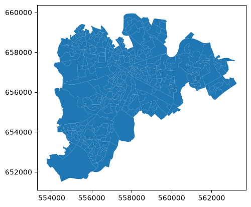
And actually, if we look at the data, we can see it has the 2016 and 2022 GUID codes in different columns, so we won’t even need a 2016 version map.
lk_sa_2022.head()Now the 2022 data:
lk_sa_data_2022 = pd.read_csv('https://github.com/bamacgabhann/GY5021/raw/2024/GY5021/3_Spatial_and_Temporal_Change/sample_data/census/lk_sa_data_2022.csv')
lk_sa_data_2022and the 2016 data:
lk_sa_data_2016 = pd.read_csv('https://github.com/bamacgabhann/GY5021/raw/2024/GY5021/3_Spatial_and_Temporal_Change/sample_data/census/lk_sa_data_2016.csv')
lk_sa_data_2016That’s the three elements we need, but they’re in three separate files. We can’t use that directly. Fortunately, we can use the GUID codes to link the data to the vector geometry.
To keep things simple, we’ll just look at raw population numbers: so rather than just merging the full datasets, we’ll extract only the GUID and population for each row from the data tables.
lk16data = lk_sa_data_2016[['GUID', 'T1_1AGETT']]  # this line extracts the GUID and population numbers to a new dataframe called lk16data
lk16data = lk16data.rename(columns = {'GUID':'SA_GUID_2016'}) # this line renames the GUID column to SA_GUID_2016, which is the relevant column name in the geometry data
lk16data = lk16data.rename(columns = {'T1_1AGETT':'2016_Population'}) # this line renames the T1_1AGETT column to 2016_Population, so we don't have identical column names for 2016 and 2022
lk16 = lk_sa_2022.merge(lk16data, on='SA_GUID_2016') # this line merges the vector geometry data with the lk16data we just made, using the SA_GUID_2016 column
# i.e. python checks both the vector geometry lk_sa_2022 and the data lk16data, and merges the rows from each with matching values in the column called SA_GUID_2016
lk16.head()lk22data = lk_sa_data_2022[['GUID', 'T1_1AGETT']] # this line extracts the GUID and population numbers to a new dataframe called lk22data
lk22data = lk22data.rename(columns = {'GUID':'SA_GUID_2022'}) # this line renames the GUID column to SA_GUID_2022, which is the relevant column name in the geometry data
lk22data = lk22data.rename(columns = {'T1_1AGETT':'2022_Population'}) # this line renames the T1_1AGETT column to 2022_Population, so we don't have identical column names for 2016 and 2022
lk22 = lk_sa_2022.merge(lk22data, on='SA_GUID_2022') # this line merges the vector geometry data with the lk22data we just made, using the SA_GUID_2022 column
# i.e. python checks both the vector geometry lk_sa_2022 and the data lk22data, and merges the rows from each with matching values in the column called SA_GUID_2022
lk22.head()We could show that with two maps side by side:
fig, (ax16, ax22) = plt.subplots(1,2, figsize=(21,7), sharey=True, layout='constrained')
ax16.set_title('Limerick population 2016')
ax22.set_title('Limerick population 2022')
lk16.plot(column='2016_Population', ax=ax16, cmap='YlGn', vmin=0, vmax=800)
lk22.plot(column='2022_Population', ax=ax22, cmap='YlGn', vmin=0, vmax=800, legend=True)
plt.show()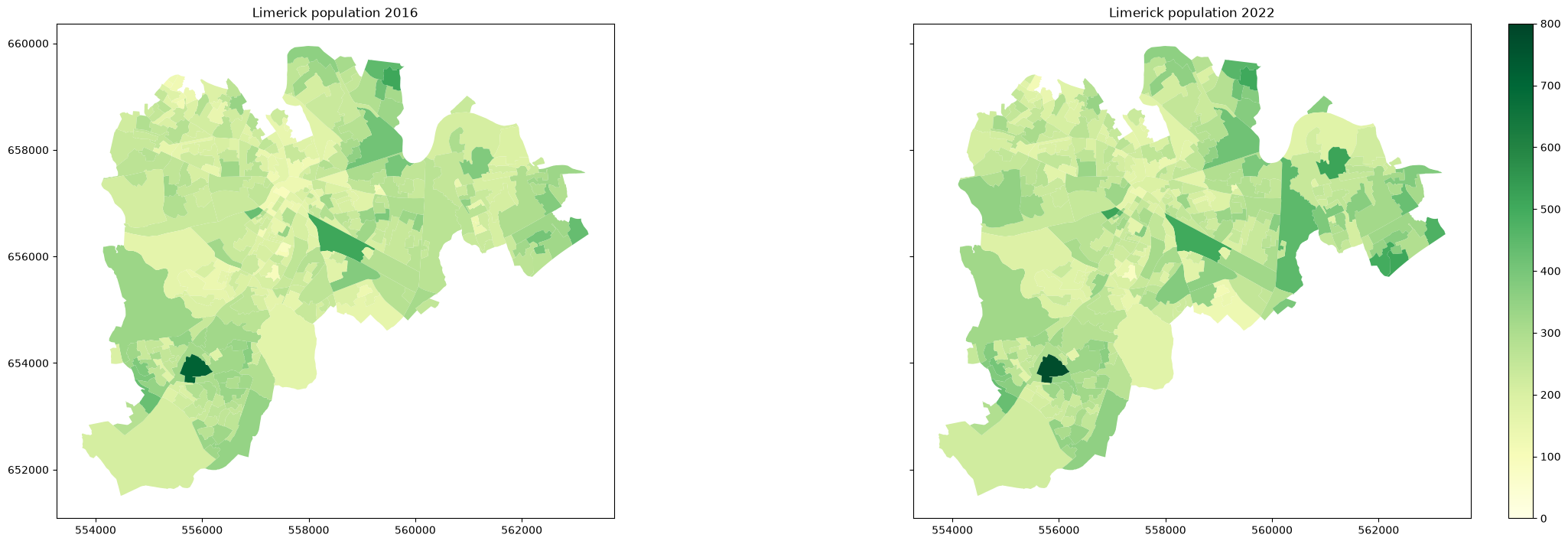
The very dark area showing a population close to 800 is the hospital, by the way.
So, some changes are pretty clear, but it’s still a bit awkward looking side by side. Why not try and show it on a single map? We have a single vector geometry geodataframe, so we can just add both population data columns into that instead of making it a new geodataframe for each year.
# we've already done most of the steps, we just need to change the last step of where we're combining the data

lk_sa_2022 = lk_sa_2022.merge(lk16data, on='SA_GUID_2016') # this line called the merged geodataframe 'lk16' last time
# this time we just add the lk16data population numbers straight into the lk_sa_2022 vector geometry geodataframe

# and now we can add the 2022 population data into the same geodataframe
lk_sa_2022 = lk_sa_2022.merge(lk22data, on='SA_GUID_2022') # again this was 'lk22' last time
lk_sa_2022.head()Scroll right, and you’ll see both 2022 and 2016 population data columns.
However, if we want a single map, we need that data combined in a single column. So, we make one by subtracting the two columns we just added.
lk_sa_2022['Population_Change'] = lk_sa_2022['2022_Population'] - lk_sa_2022['2016_Population']
lk_sa_2022.head()Scroll right to see the population change column we just made. Now we can plot this:
fig, ax = plt.subplots(figsize=(21,7), )
ax.set_title('Limerick population change 2016-2022')
lk_sa_2022.plot(column='Population_Change', ax=ax, cmap='RdBu', legend=True)
plt.show()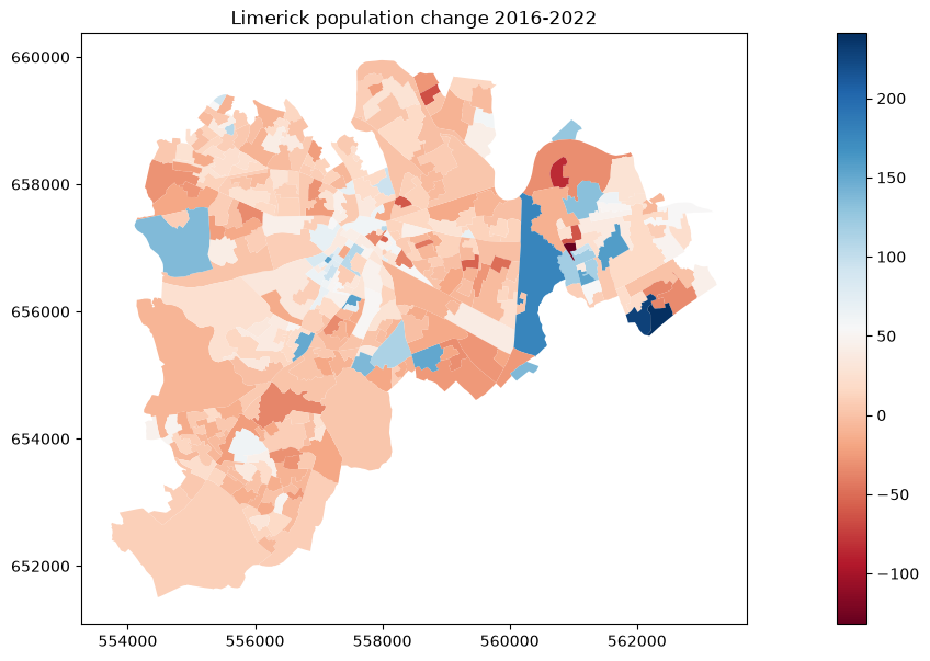
We can make this look even better if we redo it using the same trick as for the DEM terrain map in Notebook 9, making a colourmap centered at zero:
colors_pop_decrease = plt.cm.RdBu(np.linspace(0, 0.5, 256))
colors_pop_increase = plt.cm.RdBu(np.linspace(0.5, 1, 256))
all_colors = np.vstack((colors_pop_decrease, colors_pop_increase))
popchange = colors.LinearSegmentedColormap.from_list(
    'popchange', all_colors)
divnorm = colors.TwoSlopeNorm(vmin=-132, vcenter=0, vmax=241)
fig, ax = plt.subplots(figsize=(21,7), )
ax.set_title('Limerick population change 2016-2022')
lk_sa_2022.plot(column='Population_Change', ax=ax, cmap=popchange, norm=divnorm, legend=True)
plt.show()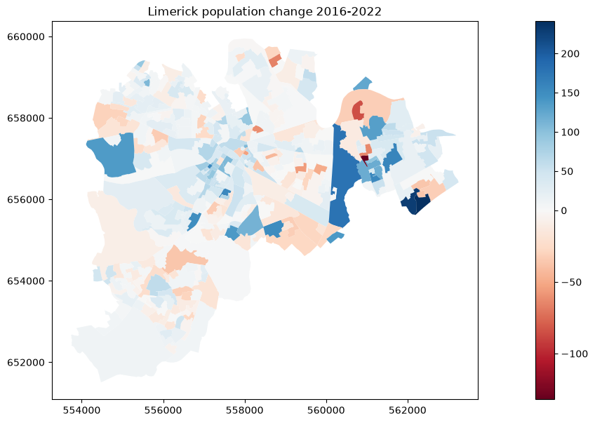
Now that looks a lot better! We can see the changes a lot more clearly here.
And that’s the simple version of how to show change in census data over time.
2. Census Geographic Areas
Yeah, there’s a ‘BUT’ coming.
Before we start really trying to analyse change in the data, let’s just take a moment to think through exactly what we just did above, what change we’re showing. In order to really think about this, we need to start by considering what’s actually in the data.
The data we used above is just parts of the full census dataset, so let’s have a closer look at them, starting with the data table.
lk_sa_data_2022.head()This is some of the census data for 2022. The columns to the right contain the actual data: by reference to the glossary, we can see what the column names refer to, with the visible columns T1_1AGE0M being a count of the number of male children 0 years old, T1_1AGE1M being a count of the number of male children 1 year old, and so on. We used T1_1AGETT above because I already know it’s the total population of the area. But what about the other columns?
The first three columns are the geographic identifiers, GUID standing for Geographic Unique IDentifier. Each row then refers to a different geographic area identified by the ID in this column, and of course we used this to link the data to the vector geometry shapes. But how are these geographic areas defined?
These particular areas we just used above are referred to as ‘small areas’, and they are defined specifically for the census. The forms for the census are tied to individual addresses, but it would be quite intrusive to publish the individual data - which includes answers to how much people earn, when they travel to work, and other sensitive information. So, the data has to be collated to be shared, in order to protect everyone’s privacy. Collating the data over large areas can obscure useful information, though - for example, if you want to see whether people are using a particular bus service. The small areas are essentially the compromise: publishing the data for quite small geographic areas, but not so small that individual people’s answers could be identified.
The small areas are defined such that each should normally have in the region of 100-200 people, and they try to keep the boundaries of the small areas meaningful where possible - following features like roads, housing estates, and similar.
However, the above is just the table of data - it’s doesn’t have the actual polygon shapes for the small areas. Of course, we joined this data table (or part of it, anyway) to the vector geometry above. Let’s look again at that vector geometry geodataframe:
lk_sa_2022.head()Here you can see two GUID values for each small area - SA_GUID_2016 and SA_GUID_2022. We used both of those above, to join the data for 2016 and 2022, but we didn’t really talk about it. If you look at the next set of columns, you’ll see SA_PUB2011, SA_PUB2016, and SA_PUB2022: that’s reference numbers for small areas for the past 3 censuses (censii?).
Why do the small areas need different reference numbers for each census?
Because the small areas change for each census.
The small areas need to change for the same reason that the census is run every 5 years. Not all small areas change every time, and they try to keep the changes to a minimum; but as the population grows, the number of people in some of the small areas will increase, urban growth will see new housing estates built in previously rural areas, and so on.
This does mean you need to be careful, because as we said at the top, in order to look at change in an area over time, you need three things:
Vector geometry features
Data for each vector geometry feature at an earlier data/time
Data for each vector geometry feature at a later data/time
And here’s the real ‘BUT’: if the geographic area itself is changing, then the change in the information (such as population) is not meaningful.
Think about what we mean by change: to look at how anything changes, we need some information which is changing, and some which is staying the same. A bus moving faster means it is travelling a larger distance (that’s the information which is changing) in the same duration of time (that’s the information which is staying the same). We can’t say the bus is faster if we’re just comparing distances travelled over different durations of time - or if it’s a different bus. We can’t say a child is getting taller if we measure a child’s height one year, and a different child’s height the next year. Has to be the same child, obviously. Similarly, for census areas, if the population grows and the area changes, what’s staying the same?
There’s two points to saying this. First, that you have to be careful when working with census data that you’re comparing like with like; since some of the small areas change each time, that needs to be accounted for. The fact that the small areas map data contains GUIDs for 2022 and 2016 means that this is generally possible for the most recent censuses, but is awkward in cases where areas have been split or reconfigured because it’s not possible to know how areas have been split or reconfigured. Secondly, it means that the further back you go, the less data you will usefully have, because of the greater changes to the areas.
In the example above, I specifically chose Limerick because there’s actually only very minor tweaks to the small areas between 2016 and 2022 - or at least, only very minor changes within the area shown. I deleted all the areas with significant changes. So it’s definitely an oversimplified example, and you won’t be able to do that everywhere.
Let’s look at an example with more change.
3. Population Change
Let’s look at Carlow from 2016 to 2022. I’ve already merged the population data with the vector polygons for the small areas, using the 2016 and 2022 small area polygons separately.
cw_sa_2016 = gpd.read_file('https://github.com/bamacgabhann/GY5021/raw/2024/GY5021/3_Spatial_and_Temporal_Change/sample_data/census/cw_sa_2016.gpkg')
cw_sa_2022 = gpd.read_file('https://github.com/bamacgabhann/GY5021/raw/2024/GY5021/3_Spatial_and_Temporal_Change/sample_data/census/cw_sa_2022.gpkg')
fig, (ax16, ax22) = plt.subplots(1,2, figsize=(21,7), sharey=True, layout='constrained')
ax16.set_title('Carlow population 2016')
ax22.set_title('Carlow population 2022')
cw_sa_2016.plot(column='Population_2016', ax=ax16, cmap='YlGn', vmin=0, vmax=650)
cw_sa_2022.plot(column='Population_2022', ax=ax22, cmap='YlGn', vmin=0, vmax=650, legend=True)
plt.show()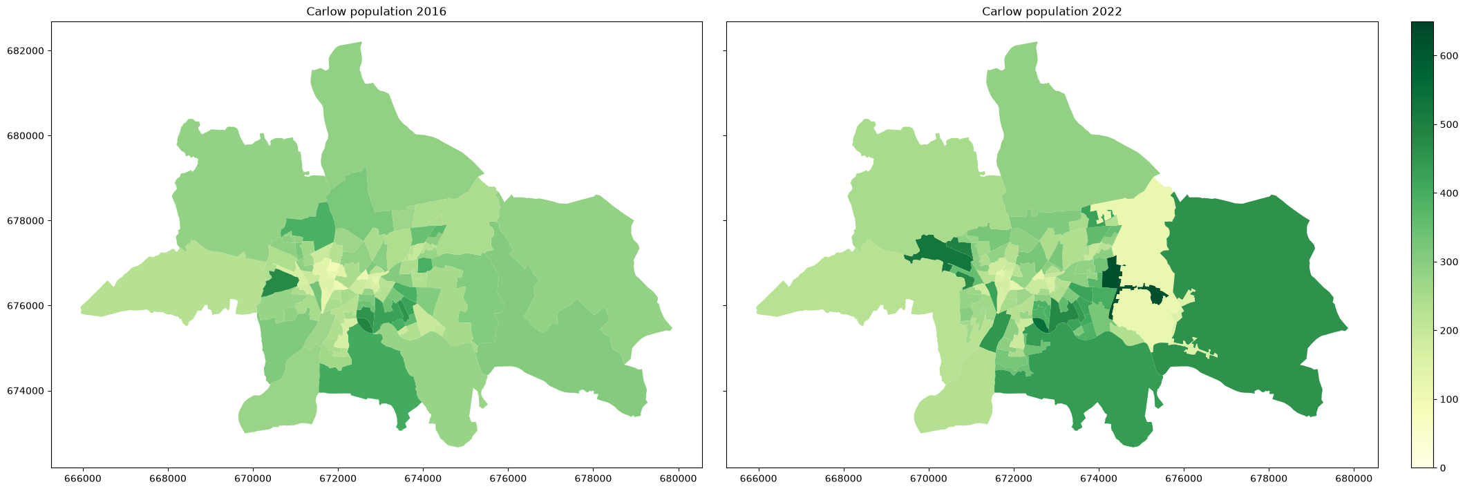
We can see that the population has increased overall, and we can see some particular areas where the population has increased. But, we can also see that the small areas themselves have changed. We can highlight this by plotting the 2022 small area boundaries on the 2016 map, and the 2016 small area bouundaries on the 2022 map:
fig, (ax16, ax22) = plt.subplots(1,2, figsize=(21,7), sharey=True, layout='constrained')
ax16.set_title('Carlow population 2016')
ax22.set_title('Carlow population 2022')
cw_sa_2016.plot(column='Population_2016', ax=ax16, cmap='YlGn', vmin=0, vmax=650)
cw_sa_2022.plot(column='Population_2022', ax=ax22, cmap='YlGn', vmin=0, vmax=650, legend=True)
cw_sa_2022.boundary.plot(ax=ax16, color='fuchsia', linewidth=0.5)
cw_sa_2016.boundary.plot(ax=ax22, color='fuchsia', linewidth=0.5)
plt.show()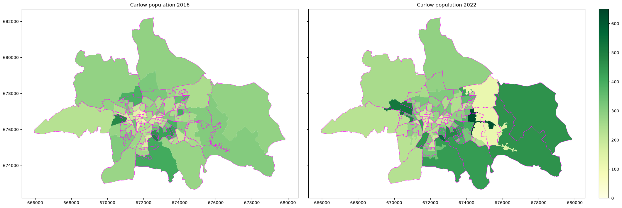
We can try to do what we did for Limerick, and put both population columns in the 2022 geometry geodataframe, using the SA_GUID_2016 and SA_GUID_2022 to link the 2016 and 2022 data respectively. In fact we already have the 2022 population data in that file, so we can add the 206 data easily in the same way we did for Limerick earlier. So first extracting the 2016 GUID and population numbers from the 2016 data, and then using the SA_GUID_2016 to join this with the 2022 geometry.
cw16data = cw_sa_2016[['SA_GUID_2016', 'Population_2016']]
cw16data.head()Now I can join this to the 2022 data:
cw_sa_change = cw_sa_2022.merge(cw16data, on='SA_GUID_2016')
cw_sa_change.head()Scroll to the right - you should see columns for both Population_2016 and Population_2022. Now we calculate a new column showing the change by simply subtracting these two:
cw_sa_change['Population_Change'] = cw_sa_change['Population_2022'] - cw_sa_change['Population_2016']Let’s plot this:
fig, ax = plt.subplots(figsize=(21,7), )
ax.set_title('Carlow population change 2016-2022')
cw_sa_change.plot(column='Population_Change', ax=ax, cmap=popchange, norm=divnorm, legend=True)
cw_sa_2016.boundary.plot(ax=ax, color='fuchsia', linewidth=0.5)
plt.show()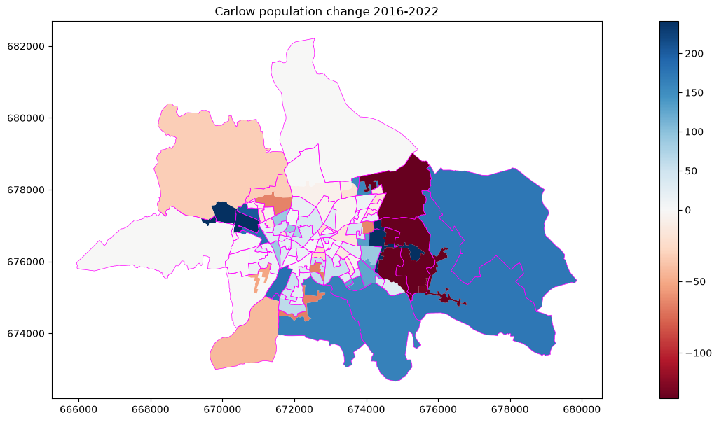
That looks nice - but remember that because some of the areas have changed, this isn’t actually showing change in population for each area. Some areas have ‘lost’ population because they’ve been divided, or had parts shifted to ther small areas, not because of actual increases or decreases in population. Only areas which have actually stayed the same will be showing meaningful changes in the actual number of people within that area:
cw2_sa_2016 = gpd.read_file('https://github.com/bamacgabhann/GY5021/raw/2024/GY5021/3_Spatial_and_Temporal_Change/sample_data/census/cw2_sa_2016.gpkg')
cw2_sa_2022 = gpd.read_file('https://github.com/bamacgabhann/GY5021/raw/2024/GY5021/3_Spatial_and_Temporal_Change/sample_data/census/cw2_sa_2022.gpkg')
cw16data2 = cw2_sa_2016[['SA_GUID_2016', 'Population_2016']]
cw_sa_change2 = cw2_sa_2022.merge(cw16data2, on='SA_GUID_2016')
cw_sa_change2['Population_Change'] = cw_sa_change2['Population_2022'] - cw_sa_change2['Population_2016']
fig, ax = plt.subplots(figsize=(21,7), )
ax.set_title('Carlow population change 2016-2022: Unchanged areas only')
cw_sa_2016.plot(ax=ax, color='dimgrey')
cw_sa_change2.plot(column='Population_Change', ax=ax, cmap=popchange, norm=divnorm, legend=True)
cw_sa_2016.boundary.plot(ax=ax, color='fuchsia', linewidth=0.5)
plt.show()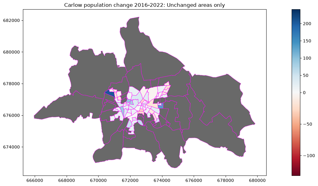
4. Alternative Geographic Levels
There’s not really any easy way to account for the changes to the small areas themselves, unless the CSO actually republish the 2016 census data using the 2022 small areas. That’s unlikely, unfortunately, because they have too much work to do already on the new data - not all the 2022 results are released yet, and they’re already developing the next census for 2026.
However, if we use larger geographic areas, there would be fewer changes. While not giving us the same spatial resolution, it’s often enough for what we need. The census data is also published at the level of:
Electoral Divisions (ED)
Local Electoral Area (LEA)
Administrative Counties
NUTS3 Regions
Provinces
Electoral Divisions were historically areas which elected local councillors, but with the change to multi-seat proportional representation areas, they’re now generally of low significance - and so aren’t changed very often. There were 3409 EDs in 2016, and 3420 in 2022 - an increase of 11, I think all due to the expansion of Cork City - although there were a small number of other tweaks as well. This makes them useful for comparing census data over time. They do have two drawbacks though: first, since they’re historic areas, and so their populations vary wildly, from fewer than 10 people to multiple thousands; and second, for the same reason, their the areas covered by different EDs also vary wildly, from a few city blocks to areas larger than entire cities.
Local Electoral Areas are the new districts from which local councillors are elected. These are revised from time to time based on population changes, so they’re less useful for comparison - but of course it’s useful to look at them in terms of them being areas represented by councillors, and so subject to political attention.
Administrative Counties are the areas covered by local Councils. These are not changed regularly, although it’s not all that long since Limerick City Council and Limerick County Council were merged into Limerick City and County Council. There’s some large-scale change comparisons possible, but they’re too large for a lot of possible change over time analyses.
NUTS3 regions are European Union data-reporting regions. They’re useful for international comparisons, but not really within Ireland.
Provinces are historic, and too large for most meaningful change analyses - I’m really not sure why the CSO still reports the data at this level.
Raw population numbers are also published in 1km grid squares, although this doesn’t come with the other census data.
lk_ed_2022 = gpd.read_file('https://github.com/bamacgabhann/GY5021/raw/2024/GY5021/3_Spatial_and_Temporal_Change/sample_data/census/lk_ed_2022.gpkg')
lk_ed_2016 = gpd.read_file('https://github.com/bamacgabhann/GY5021/raw/2024/GY5021/3_Spatial_and_Temporal_Change/sample_data/census/lk_ed_2016.gpkg')
fig, (ax16, ax22) = plt.subplots(1,2, figsize=(21,7), sharey=True, layout='constrained')
ax16.set_title('Limerick ED population 2016')
ax22.set_title('Limerick ED population 2022')
lk_ed_2016.plot(column='T1_1AGETT', ax=ax16, cmap='YlGn', vmin=0, vmax=18500)
lk_ed_2022.plot(column='T1_1AGETT', ax=ax22, cmap='YlGn', vmin=0, vmax=18500, legend=True)
lk_sa_2022.boundary.plot(ax=ax16, color='fuchsia', linewidth=0.5)
lk_sa_2022.boundary.plot(ax=ax22, color='fuchsia', linewidth=0.5)
plt.show()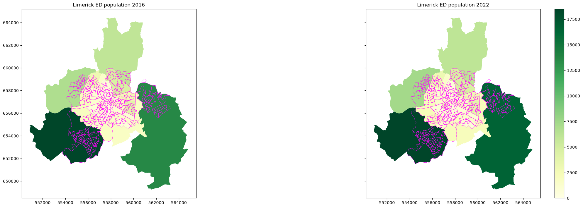
cw_ed_2022 = gpd.read_file('https://github.com/bamacgabhann/GY5021/raw/2024/GY5021/3_Spatial_and_Temporal_Change/sample_data/census/cw_ed_2022.gpkg')
cw_ed_2016 = gpd.read_file('https://github.com/bamacgabhann/GY5021/raw/2024/GY5021/3_Spatial_and_Temporal_Change/sample_data/census/cw_ed_2016.gpkg')
fig, (ax16, ax22) = plt.subplots(1,2, figsize=(21,7), sharey=True, layout='constrained')
ax16.set_title('Carlow ED population 2016')
ax22.set_title('Carlow ED population 2022')
cw_ed_2016.plot(column='T1_1AGETT', ax=ax16, cmap='YlGn', vmin=0, vmax=18500)
cw_sa_2016.boundary.plot(ax=ax16, color='fuchsia', linewidth=0.5)
cw_ed_2022.plot(column='T1_1AGETT', ax=ax22, cmap='YlGn', vmin=0, vmax=18500, legend=True)
cw_sa_2022.boundary.plot(ax=ax22, color='fuchsia', linewidth=0.5)
plt.show()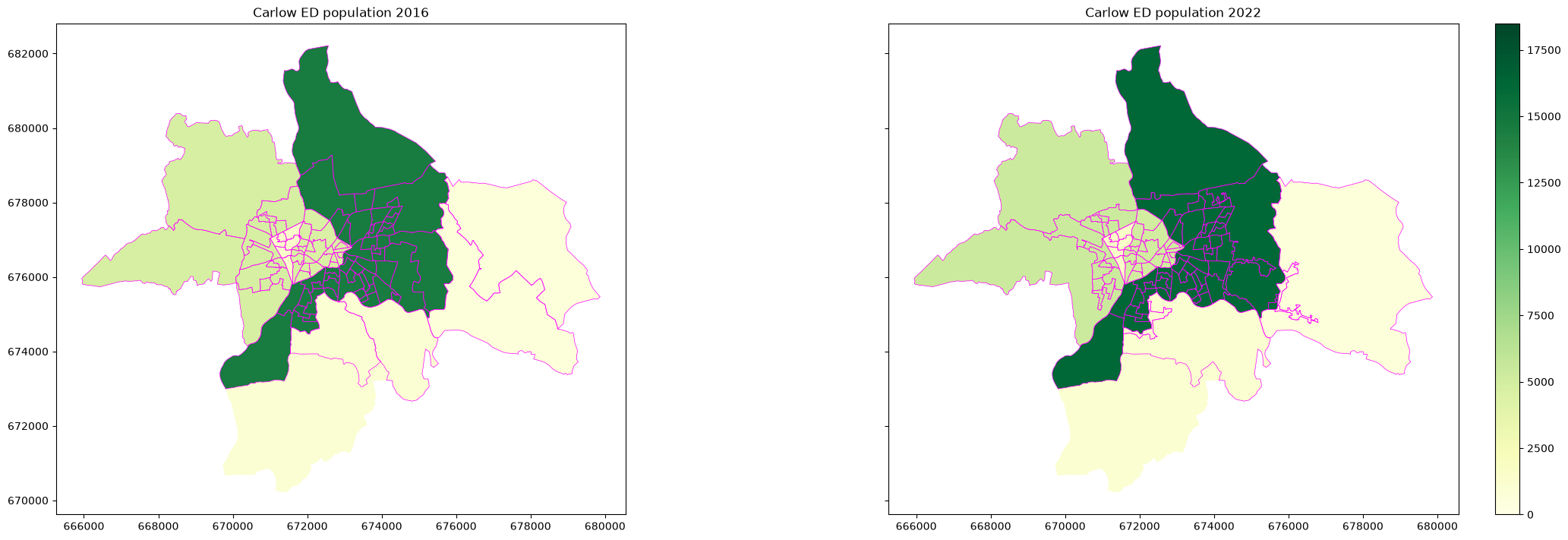
The population change looks smaller at ED level, yes?
Unfortunately, plotting a direct comparison on a single map is made more awkward by the CSO using different map polygons with different GUIDs, and the only shared attribute is called “ED_ID” in 2016, with leading zeros, and “ED_ID_STR” in 2022 without leading zeros. Meaning I had to manually edit these to match them up.
Anyway, I did it, so here:
lk_ed = gpd.read_file('https://github.com/bamacgabhann/GY5021/raw/2024/GY5021/3_Spatial_and_Temporal_Change/sample_data/census/lk_ed.gpkg')
cw_ed = gpd.read_file('https://github.com/bamacgabhann/GY5021/raw/2024/GY5021/3_Spatial_and_Temporal_Change/sample_data/census/cw_ed.gpkg')

fig, ((axlk_ed, axlk_sa), (axcw_ed, axcw_sa)) = plt.subplots(2,2, figsize=(21,15))
axlk_ed.set_title('Limerick ED population change 2016-2022')
axlk_sa.set_title('Limerick SA population change 2016-2022')
axcw_ed.set_title('Carlow ED population change 2016-2022')
axcw_sa.set_title('Carlow SA population change 2016-2022')
lk_ed.plot(column='Population_Change', ax=axlk_ed, cmap='Blues', vmin=0, vmax=3000, legend=True)
lk_sa_2022.boundary.plot(ax=axlk_ed, color='fuchsia', linewidth=0.5)
lk_sa_2022.plot(column='Population_Change', ax=axlk_sa,  cmap=popchange, norm=divnorm, legend=True)
lk_ed_2022.boundary.plot(ax=axlk_sa, color='fuchsia', linewidth=0.5)
cw_ed.plot(column='Population_Change', ax=axcw_ed, cmap='Blues', vmin=0, vmax=3000, legend=True)
cw_sa_2022.boundary.plot(ax=axcw_ed, color='fuchsia', linewidth=0.5)
cw_sa_change.plot(column='Population_Change', ax=axcw_sa, cmap=popchange, norm=divnorm, legend=True)
cw_ed_2016.boundary.plot(ax=axcw_sa, color='fuchsia', linewidth=0.5)
plt.show()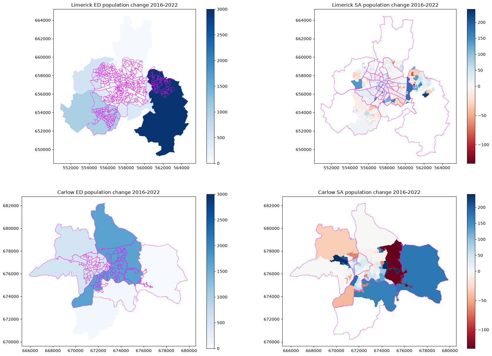
Honestly, cleaning the data to make this took me about 5 hours. Do not recommend unless important. Which just serves to reinforce the point that you’ll probably spend most of your mapping work time cleaning data, unless you’re very lucky.
So, in theory, census data is great to show over time - but be careful, because it’s not always as straightforward as you might think.
5. Beyond Population Data
Of course, for areas which don’t change boundaries, you can do a lot more than just look at the raw population numbers.
pd.options.mode.copy_on_write = True # this line is just changing a setting to make this work more easily

# Let's extract the data for walking, cycling, bus, and train/dart/luas to work/school/college for 2016 and 2022
lk16tr = lk_sa_data_2016[['GUID', 'T11_1_FT', 'T11_1_BIT', 'T11_1_BUT', 'T11_1_TDLT', 'T11_1_TT']]
lk22tr = lk_sa_data_2022[['GUID', 'T11_1_FT', 'T11_1_BIT', 'T11_1_BUT', 'T11_1_TDLT', 'T11_1_TT']]

# Calculate some new attributes for public and active transport
lk16tr['active_transport_2016'] = ((lk16tr['T11_1_FT'] + lk16tr['T11_1_BIT'])/lk16tr['T11_1_TT'])*100  # commuting on foot + commuting by bike as % fpr 2016
lk16tr['public_transport_2016'] = ((lk16tr['T11_1_BUT'] + lk16tr['T11_1_TDLT'])/lk16tr['T11_1_TT'])*100  # commuting by bus + commuting by train/dart/luas as % for 2016
lk16tr['pub_act_transport_2016'] = lk16tr['public_transport_2016'] + lk16tr['active_transport_2016']  # sum of foot/bike and bus/train/dart/luas for 2016
lk22tr['active_transport_2022'] = ((lk22tr['T11_1_FT'] + lk22tr['T11_1_BIT'])/lk22tr['T11_1_TT'])*100  # commuting on foot + commuting by bike as % fpr 2022
lk22tr['public_transport_2022'] = ((lk22tr['T11_1_BUT'] + lk22tr['T11_1_TDLT'])/lk22tr['T11_1_TT'])*100  # commuting by bus + commuting by train/dart/luas as % for 2022
lk22tr['pub_act_transport_2022'] = lk22tr['public_transport_2022'] + lk22tr['active_transport_2022']  # sum of foot/bike and bus/train/dart/luas for 2022

# drop the raw data columns because we're finished with them
lk16tr = lk16tr.drop(['T11_1_FT', 'T11_1_BIT', 'T11_1_BUT', 'T11_1_TDLT', 'T11_1_TT'], axis=1)
lk22tr = lk22tr.drop(['T11_1_FT', 'T11_1_BIT', 'T11_1_BUT', 'T11_1_TDLT', 'T11_1_TT'], axis=1)

# rename the GUID columns to SA_GUID_2016 and SA_GUID_2022, which is the relevant column names in the geometry data
lk16tr = lk16tr.rename(columns = {'GUID':'SA_GUID_2016'})
lk22tr = lk22tr.rename(columns = {'GUID':'SA_GUID_2022'})

# merge the vector geometry data with the transport data we just calculated, using the SA_GUID_2016 and SA_GUID_2022 columns
lk_tr = lk_sa_2022.merge(lk16tr, on='SA_GUID_2016')
lk_tr = lk_tr.merge(lk22tr, on='SA_GUID_2022')

# Calculate new attributes for change 2016-2022
lk_tr['active_transport_change'] = lk_tr['active_transport_2022'] - lk_tr['active_transport_2016']
lk_tr['public_transport_change'] = lk_tr['public_transport_2022'] - lk_tr['public_transport_2016']
lk_tr['pub_act_transport_change'] = lk_tr['pub_act_transport_2022'] - lk_tr['pub_act_transport_2016']

# Set up a new colour scale for the change attributes
colors_change_down = plt.cm.RdBu(np.linspace(0, 0.5, 256))
colors_change_up = plt.cm.RdBu(np.linspace(0.5, 1, 256))
all_change = np.vstack((colors_change_down, colors_change_up))
tr_change = colors.LinearSegmentedColormap.from_list(
    'tr_change', all_change)
div_tr = colors.TwoSlopeNorm(vmin=-50, vcenter=0, vmax=50)

# Plot the results
fig, ((pt16, pt22, ptch), (at16, at22, atch), (pat16, pat22, patch)) = plt.subplots(3,3, figsize=(21,21), sharex=True, sharey=True, layout='constrained')
pt16.set_title('Public Transport in Limerick 2016')
pt22.set_title('Public Transport in Limerick 2022')
ptch.set_title('Public Transport Change in Limerick 2016-2022')
at16.set_title('Active Transport in Limerick 2016')
at22.set_title('Active Transport in Limerick 2022')
atch.set_title('Active Transport Change in Limerick 2016-2022')
pat16.set_title('Public and Active Transport in Limerick 2016')
pat22.set_title('Public and Active Transport in Limerick 2022')
patch.set_title('Public and Active Transport Change in Limerick 2016-2022')

lk_tr.plot(column='public_transport_2016', ax=pt16, cmap='Greens', vmin=0, vmax=100, legend=False)
lk_tr.plot(column='public_transport_2022', ax=pt22, cmap='Greens', vmin=0, vmax=100, legend=True)
lk_tr.plot(column='public_transport_change', ax=ptch, cmap=tr_change, norm=div_tr, legend=True)
lk_tr.plot(column='active_transport_2016', ax=at16, cmap='Greens', vmin=0, vmax=100, legend=False)
lk_tr.plot(column='active_transport_2022', ax=at22, cmap='Greens', vmin=0, vmax=100, legend=True)
lk_tr.plot(column='active_transport_change', ax=atch, cmap=tr_change, norm=div_tr, legend=True)
lk_tr.plot(column='pub_act_transport_2016', ax=pat16, cmap='Greens', vmin=0, vmax=100, legend=False)
lk_tr.plot(column='pub_act_transport_2022', ax=pat22, cmap='Greens', vmin=0, vmax=100, legend=True)
lk_tr.plot(column='pub_act_transport_change', ax=patch, cmap=tr_change, norm=div_tr, legend=True)

lk_sa_2022.boundary.plot(ax=pt16, color='fuchsia', linewidth=0.5)
lk_sa_2022.boundary.plot(ax=pt22, color='fuchsia', linewidth=0.5)
lk_sa_2022.boundary.plot(ax=ptch, color='fuchsia', linewidth=0.5)
lk_sa_2022.boundary.plot(ax=at16, color='fuchsia', linewidth=0.5)
lk_sa_2022.boundary.plot(ax=at22, color='fuchsia', linewidth=0.5)
lk_sa_2022.boundary.plot(ax=atch, color='fuchsia', linewidth=0.5)
lk_sa_2022.boundary.plot(ax=pat16, color='fuchsia', linewidth=0.5)
lk_sa_2022.boundary.plot(ax=pat22, color='fuchsia', linewidth=0.5)
lk_sa_2022.boundary.plot(ax=patch, color='fuchsia', linewidth=0.5)

plt.show()
/tmp/ipykernel_34206/2545341840.py:1: Pandas4Warning: The 'mode.copy_on_write' option is deprecated. Copy-on-Write can no longer be disabled (it is always enabled with pandas >= 3.0), and setting the option has no impact. This option will be removed in pandas 4.0.
pd.options.mode.copy_on_write = True # this line is just changing a setting to make this work more easily
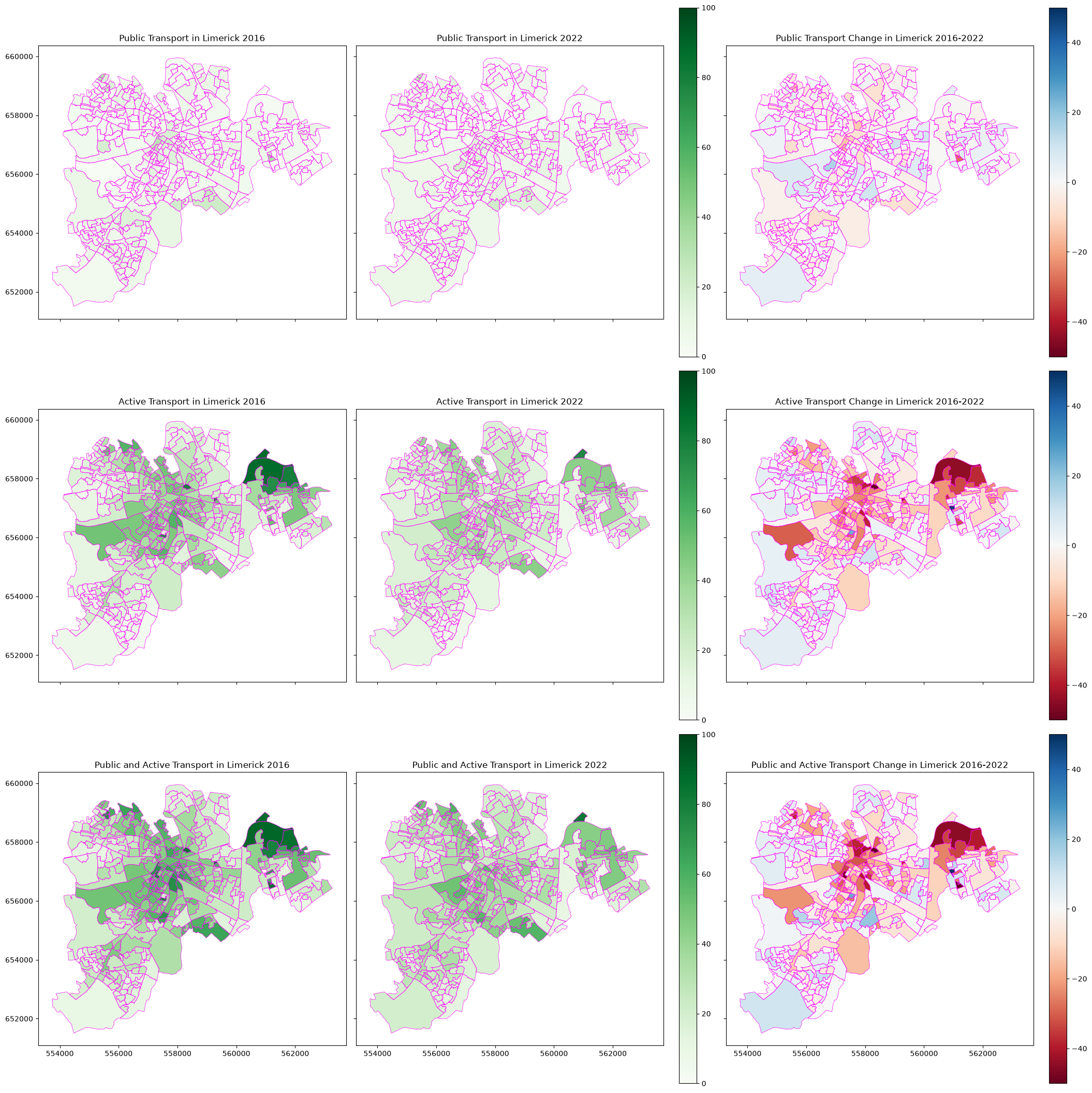
The next steps here would be to add some bus routes, stop locations, stop catchment areas, cycle lanes etc. Hopefully you can see the potential - just be wary of the data cleaning needed to make it work, if it’s possible.
Summary
The key point here is that if you want to show change over time in vector data, at the core it’s no different from showing any other vector data. You need two things:
vector geometry
data in an attribute column
just like any other vector map.
The only difference is in where the attribute data comes from. Normally, it will involve some simple maths - subtracting data for the earlier date from the data for the later date.
The complicated part, as in the example above, is in ensuring the data for both dates refers to exactly the same geometry shapes.
There’s simple examples where this is less of an issue - for example if you want to illustrate data for countries, it’s mostly straightforward, although you do need to watch out for examples like East and West Germany.
But for census data (and of course the same might apply to other examples), this isn’t straightforward, and often requires a lot of checking and data cleaning to get the data into a usable format.